Art for Print/Publishing Photoshop Tutorial
As someone who is interested in art, and particularly digital art, I often run across websites of people who are trying to get their worked published in book form. They either plan on self-publishing or going the old fashioned route of finding someone who will publish their book. It’s usually a children’s book. I often hear these same people tell stories of how the art for their project looked great on the screen but once they printed it out using whatever printing service they chose (usually for the purposes of making a mock-up of the book) the art was dull and the details had washed out.
I’ve worked in publishing before and have had numerous children’s books featuring my art appear in stores like Barne’s and Noble etc. I often found myself in the same predicament as the people I mentioned above and only after years of searching did I find the solution that truly works. That’s why I’m providing you with this tutorial. Hopefully it’ll save some poor soul the pain of working on a children’s book, or other art book, for months or even years only to find out that the magnificent on screen art is actually terrible for print and must be redone.
The problem we’re seeing here isn’t that the artwork isn’t well planned out or not high quality. It also isn’t because the file sizes weren’t large enough or high enough quality (although you should be working in at least 300 DPI). The problem is simply that the computer monitor does something that a piece of paper will never be able to do. The computer monitor projects light. Nothing will ever look as vibrant in print as it does on the screen. So how do we avoid our nightmare printing scenario?
The masterminds at Adobe were smart enough to recognize this monitor-to-paper disconnect and actually created a tab in Photoshop that gives the artist the information they need to avoid printing disasters. The only problem is most people don’t know about it.
It’s called ‘Total Inks’ and it can be found in the ‘Panel Options’ of the ‘Info’ histogram.
So here are the steps along with some screen grabs to show you what I’m talking about. The artwork in the steps is a fan art that I made of Cammy White from the legendary Street Fighter franchise. I loves me some Cammy.
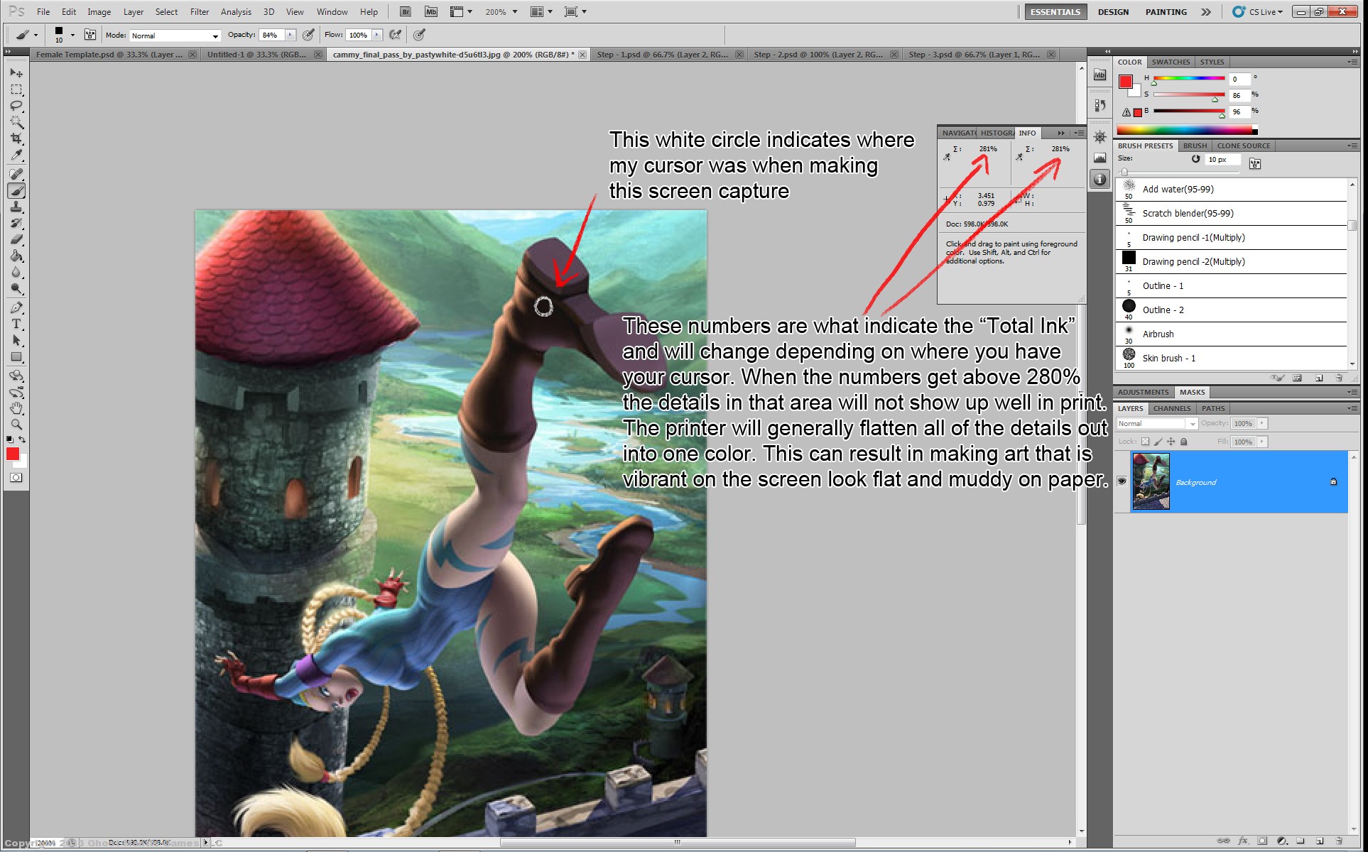
Once Photoshop is open you’re going to have to make sure that you can see your ‘Total Inks’ tab which is used to indicate the amount of ink the printer will have to use to create your color/hue/value in any particular area of a painting. Once the total amount of ink passes a certain threshold, which is 280% in the ‘Total Ink’ tab, the paper becomes too wet and has too much ink on it to really separate out details. Certain parts of a piece can still be above the 280% threshold such as eyelashes which are almost always 300%, but the details surrounding anything that is above 280% should be less than 280%. Basically if you’re creating a very dark scene and you run your cursor over the image and generally the numbers you’re seeing in the ‘Total Inks’ tab are above 280%, your image will not print well unless you go to a really high end printer. The problem is most published books are mass produced (and why wouldn’t they be?) therefore the paper and print itself is of a lower quality more suitable for high demand printing. These types of prints can’t separate out the smaller details unless they stay within the proper ink threshold.
Ok Let’s get to the how-to part of this tutorial.
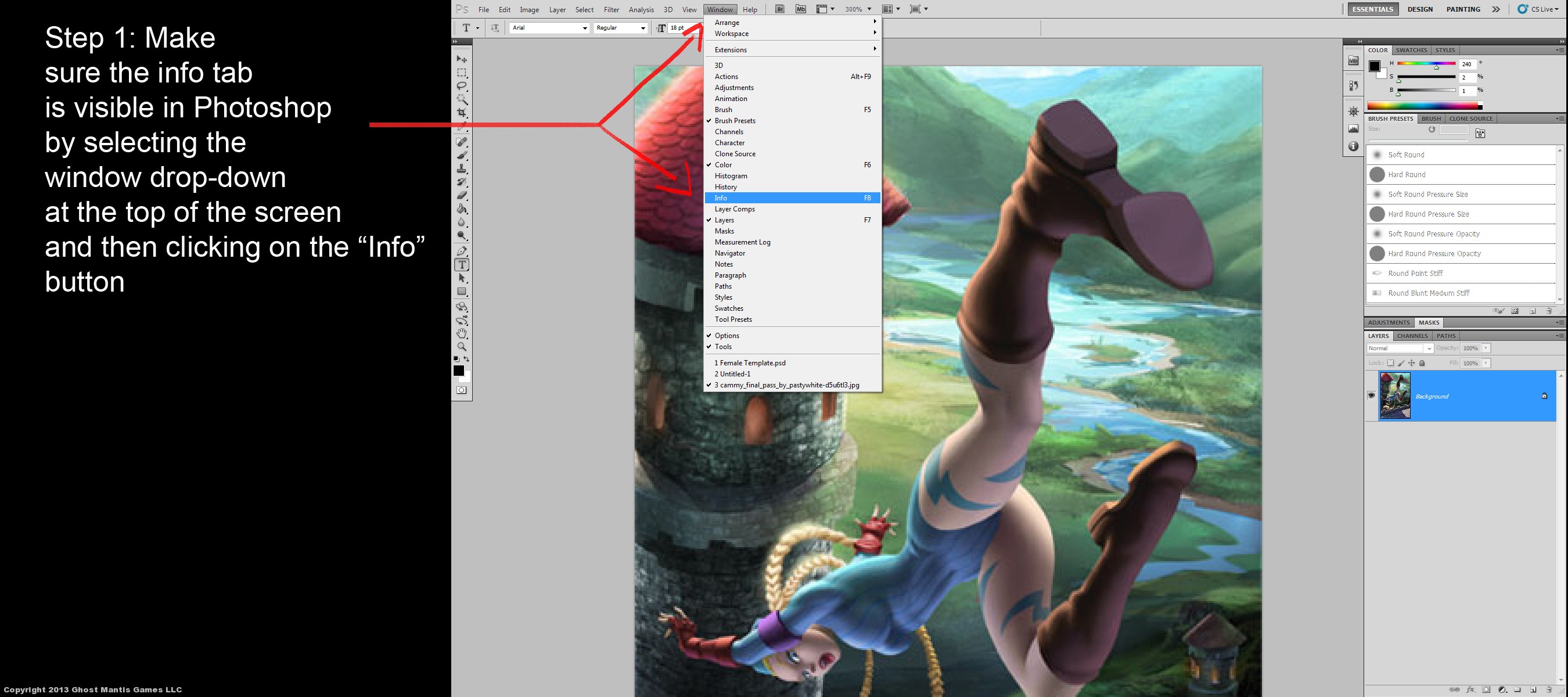
Step 1: Now that you’ve got Photoshop open make sure that the ‘Total Inks’ tab is visible. Do this by clicking the ‘Window’ tab on the top of the Photoshop interface. It’s located between the ‘View’ and ‘Help’ tabs.
Step 2: A drop-down menu will appear after clicking the ‘Window’ tab. From that list, select ‘Info’. This should now make the ‘Info’ tab visible if it wasn’t already.
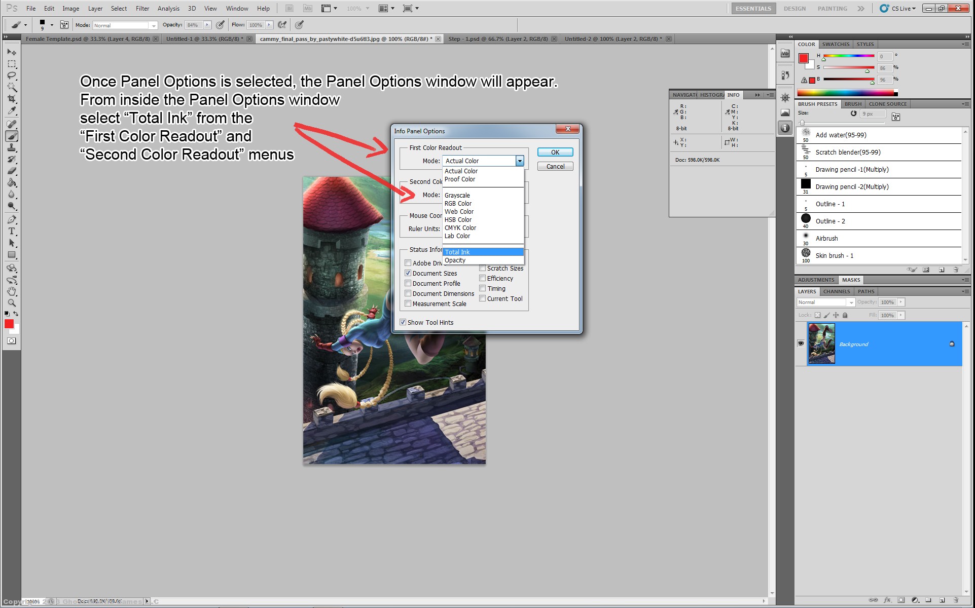
Step 3: On the very top right of the ‘Info’ tab there is an icon that looks like a tiny arrow pointing downward and has some horizontal lines next to it. This indicates that you will find more options regarding the ‘Info’ tab if you click it. You’ll find this same icon in many different places in Photoshop and it always indicates that there are more options available to you for whatever tab you find this icon in. OK, click the icon and in the new window that appears select ‘Panel Options’
Step 4: Once the ‘Panel Options’ window appears you’ll notice that it contains sections called ‘First Color Readout’ and ‘Second Color Readout’. Each one of those sections contains the word ‘Mode’ next to a drop down menu. Click on the drop down menu in both of the sections and choose the ‘Total Ink’ option.
That’s it! Now that you’ve chosen ‘Total Ink’, you’ll notice that the numbers in the ‘Info’ histogram have now changed. There are new numbers next to little squiggly icons on the top of the ‘Info’ histogram showing what appear to be random percentages. If you, however, simply move your cursor around the art piece you’ll notice that the percentages will change. Generally, the lighter the color is the lower the number is.
When setting up a composition, even a very dark one, you’ll want to keep the overall percentages less than 280%. Things that are very dark, like pupils and eyelashes, will almost always be above 280% but that’s ok because the details surrounding them are usually lighter. The eyelashes are surrounded by skin tones and the pupils are surrounded by the color of the iris. Even if the iris is supposed to be brown, make sure the colors of it are generally a lower number than 280 and you’ll be fine.
Keep in mind this tutorial only applies to publishing and print work. Things in print always look darker than they do on a screen, so if you’re just doing some badass art for your website you won’t have to worry about this, and generally if concept art ever makes it to print (such as the art for companies like Blizzard), the book is printed in much lower quantities than say a Disney Book. They’re also generally forced to shell out the extra cash for a higher quality print or they’ll encounter the problems I’ve mentioned. This is why art books tend to be hardcover and more expensive overall.
Sure you could always go through the art work and try to finagle it by doing layer adjustments and color corrections, but why go through the headache when you can now get it right the first time?
Anyways, I really hope this tutorial helped. This information changed my world once I knew about it. If any of the information in this tutorial was unclear or confusing I hope that by reviewing the attached screenshots you’ll have a better understanding of what I’m talking about.
Cheers,
Pastywhite